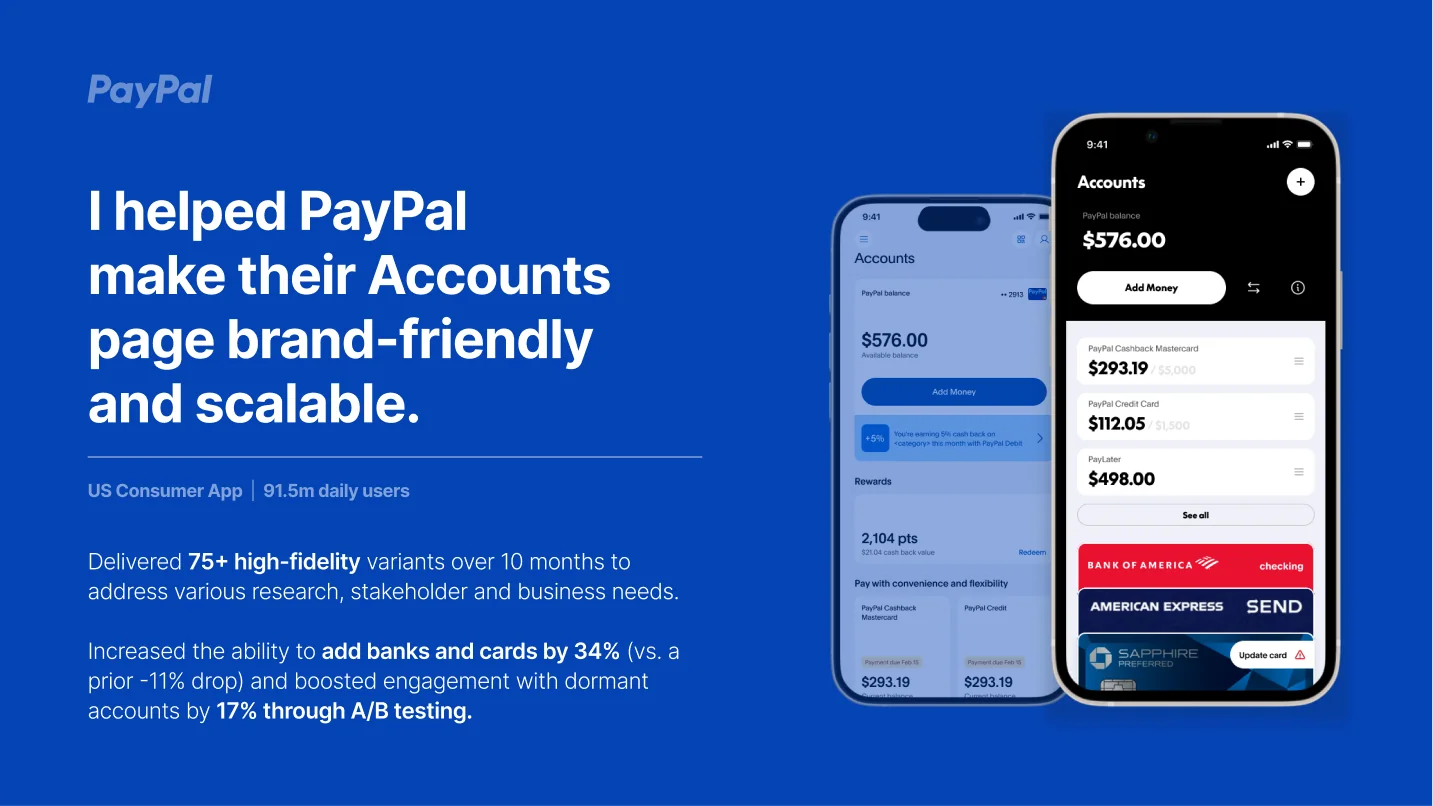
Making PayPal's Accounts page brand-friendly and scalable for 91.5 million daily users.
The problem
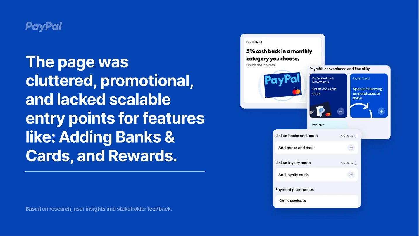
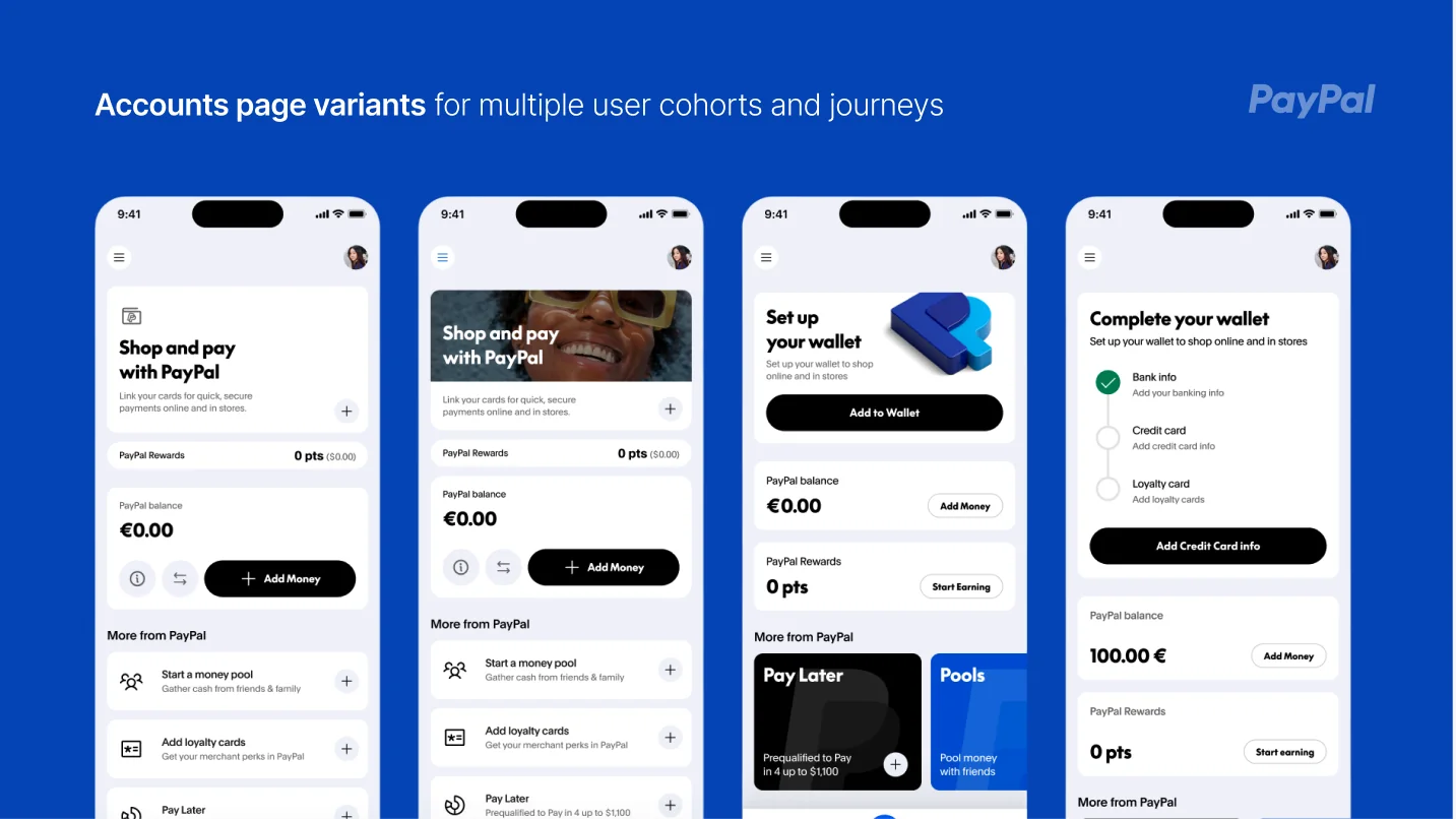
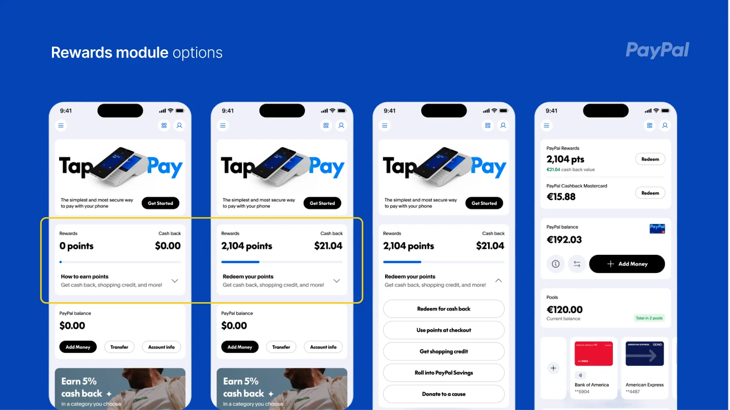
The Accounts page had become cluttered and promotional, and it lacked scalable entry points for core features like adding banks and cards and Rewards. Research, user insights, and stakeholder feedback all pointed at the same page.
Adds of banks and cards had actually dropped 11% before the redesign effort began.
What I did
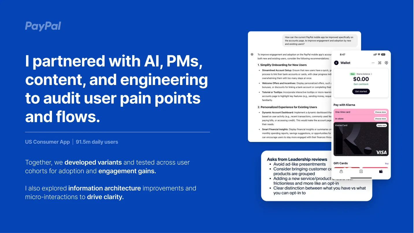
I partnered with AI tools, PMs, content designers, and engineering to audit user pain points and flows. Together we developed variants and tested across user cohorts for adoption and engagement gains, and I explored information architecture improvements and micro-interactions to drive clarity.
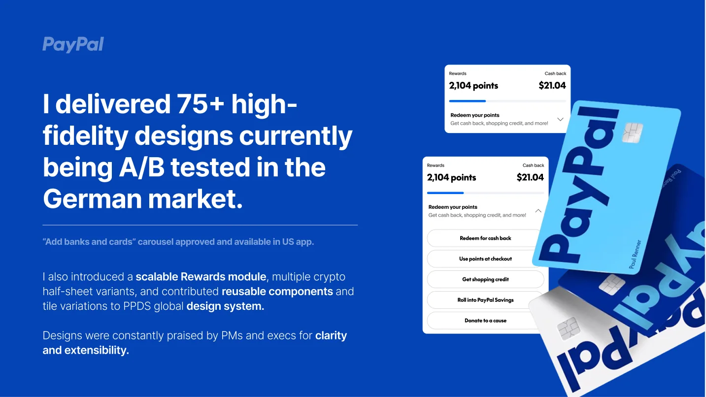
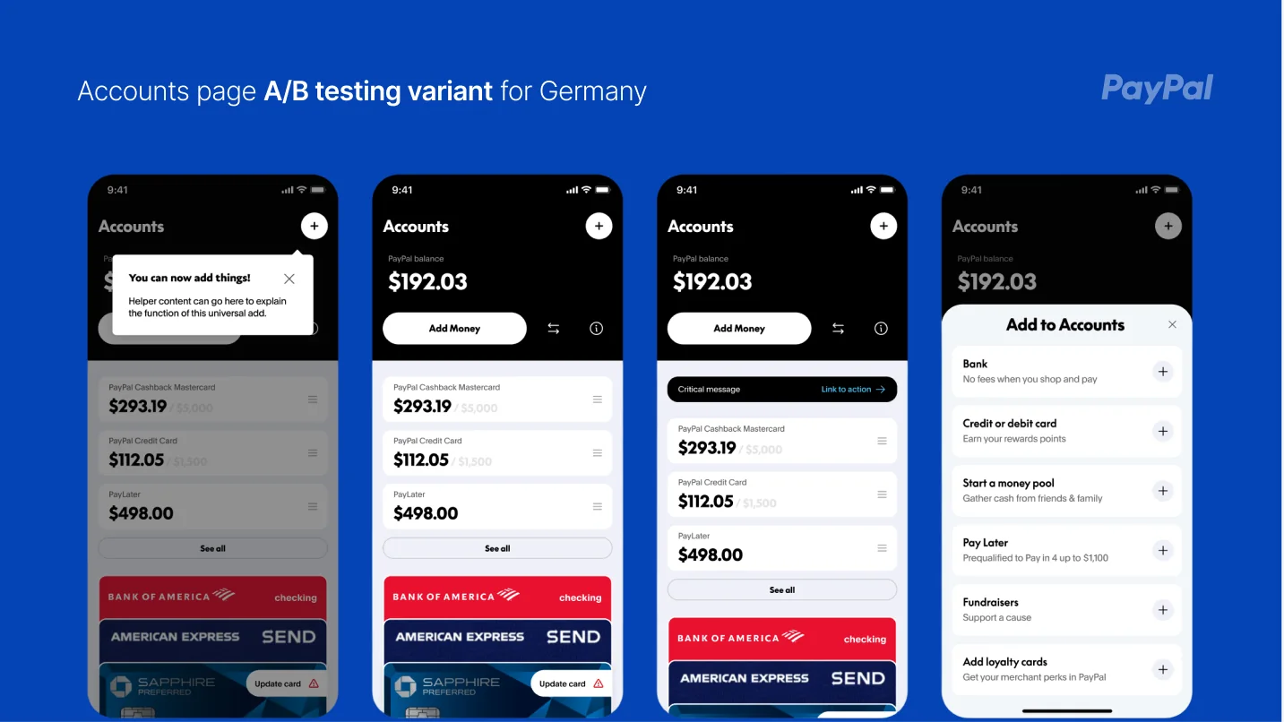
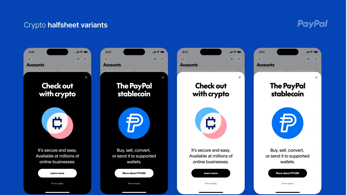
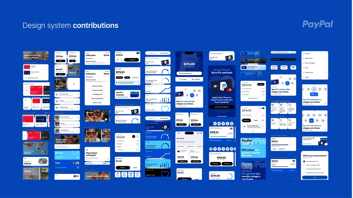
Over ten months I delivered 75+ high-fidelity variants addressing research, stakeholder, and business needs, including a scalable Rewards module, multiple crypto half-sheet variants, and reusable components and tile variations contributed back to PPDS, PayPal's global design system.
Outcomes
The “Add banks and cards” carousel was approved and is live in the US app, and designs were consistently praised by PMs and execs for clarity and extensibility.